NASA Website Redesign
A design refresh for a more intuitive user experience and modern look.
UX Research | UI Design
UX Case Study
〰️
UX Case Study 〰️
Summary
NASA is a major leader in space exploration, scientific discovery, and technology innovation.
The website showcases NASA's missions, research, and technological advancements, highlighting the agency's commitment to advancing our understanding of the universe and our place within it. When you think of NASA, its technological achievements, dazzling photography, and incredible engineering you would assume their website was clean, well organized, and modern. In reality users are faced with an outdated, clustered, and confusing site to navigate.
NASA's Impact
NASA’s significance can be seen across numerous fields, including science, technology, aeronautics, and exploration. With 85 Million followers on Instagram, 60 Million on Twitter, 25 Million on Facebook, and 11 Million subscribers on Youtube, it's safe to say that their engagement with world is large.
Project Goals
Develop a more intuitive and consistent navigation process making it easier for people of all ages to use.
Deliver an engaging user experience that makes users want to keep revisiting the site.
Design a solution for users to quickly access their favorite missions, telescopes and topics so that users may discover images and articles of interest easily.
Duration | 3 Wks
Tools Used | Figma, Miro
Design Process
Discover
Methodology
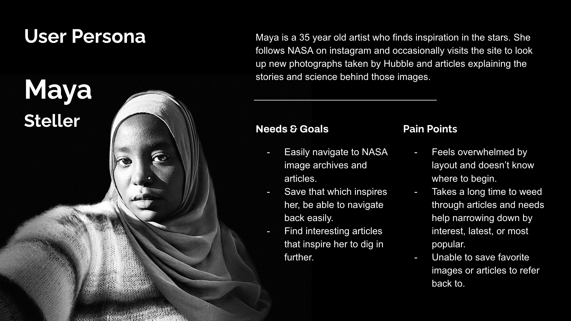
NASA’s audience is quite large, from young children to adults of all ages and backgrounds. I wanted to gain an understanding what major problems users encountered while navigating the NASA website. This was accomplished by conducting a usability test of the current site.
A usability test with 5 users, ages 30 - 45 years old was conducted. Participants were asked to browse the site as they normally would and find an image of the Milky Way, and article on a special topic. From there, participants were encouraged to express their thoughts on what they liked or disliked as they browsed the site.
User Flow
Key User Pain Points & Needs
1. Navigation and overall UI are confusing — Participants were disappointed and stated that the navigation process was more complicated than expected or necessary.
2. Navigation and overall UI is overwhelming — Participants were distracted and overwhelmed by layout and density on pages, want an easier way to view content and cleaner layout.
3. Unorganized articles and information — Participants expected more organization and categorization.
4. Users wanted to find topics and images more easily — Participants expressed wanting to see hierarchy to understand how to engage and navigate the site, as well as easily discover related and trending topics & images.
Ideate
Testing navigation
Another set of usability tests with 3 users, ages 30 - 45 years old was conducted. Participants were asked to navigate the site on both desktop and browser, fulfilling specific tasks to navigate to pages from the homepage. From there, participants were encouraged to express their thoughts on what they liked or disliked as they browsed the site.
Results
Some pages where easier to navigate to due to labeling than others with less straightforward title and repetitive titling. The user testing the mobile site thought the site was cleaner on mobile than desktop, the layout was easier to read and looked less cluttered, because it was a single column.
Information Architecture
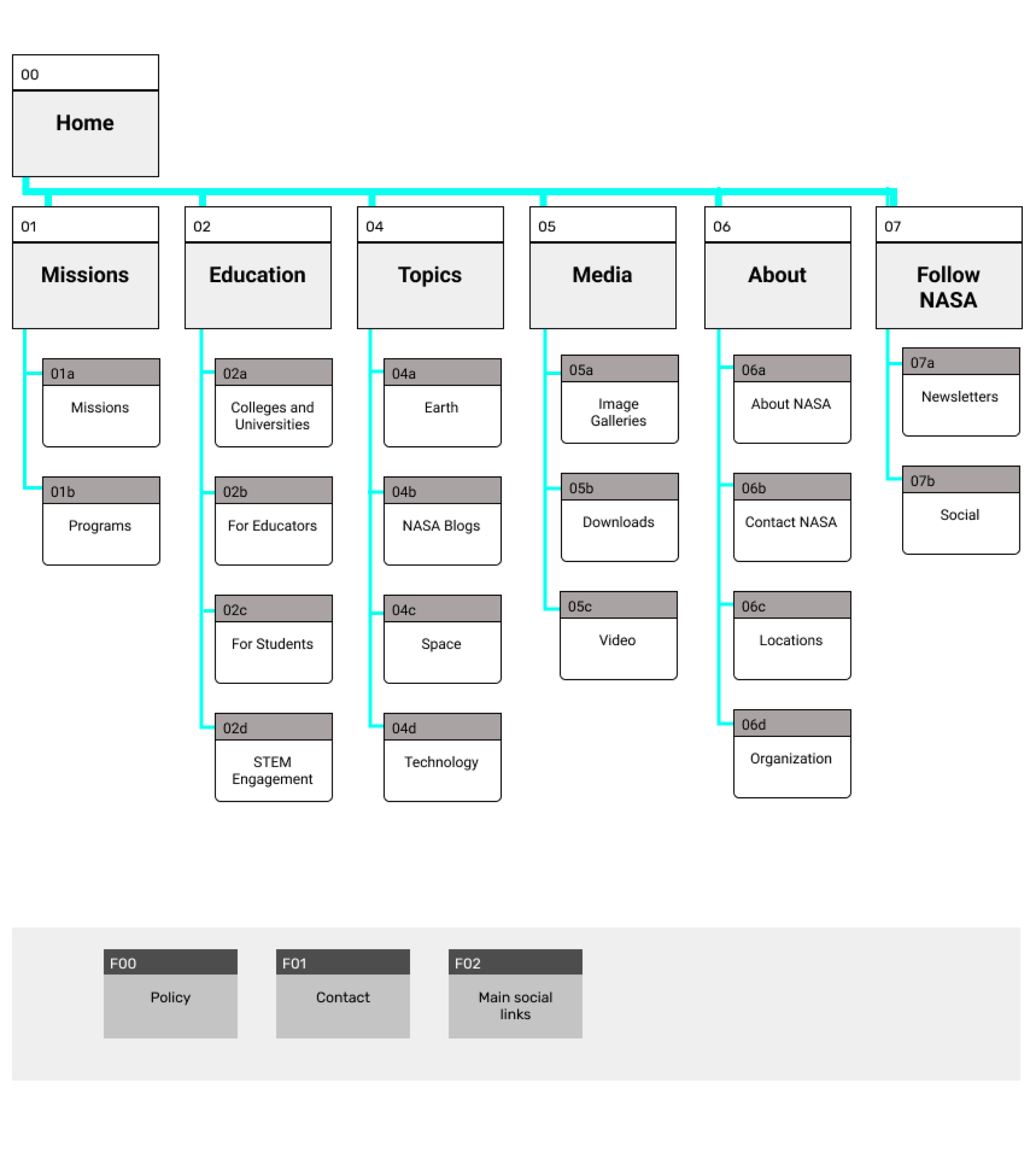
To sort information in a more clear way, open card sorting was employed to find solutions to better navigation and page flow.
This was done is three phases
1. Define
2. Group
3. Structure
Resulting in an updated Sitemap.
Primary pages:
Missions
Education
Topics
About
Media
Follow
Footer:
Policy
Main Social Icons
Contact
Latch Principles
Category
Alphabetical
Hierarchy
5 second testing - Navigation
2 A/B tests were conducted to understand if navigation design was clear, and if we should label Programs of NASA under “Missions”.
Heuristic Evaluation
Overall the site could be vastly improved by cleaning up the amount of content seen on a page and providing hierarchy. Users feel the current site is overwhelming and confusing to navigate because of the visual and copy clutter.
The site did well when a color accessibility test was done, but improvements can be made anywhere a lighter blue is seen with white text overlay. The refresh keeps in mind contrast, and focuses on making the site more readable and easier to digest.
Prototyping
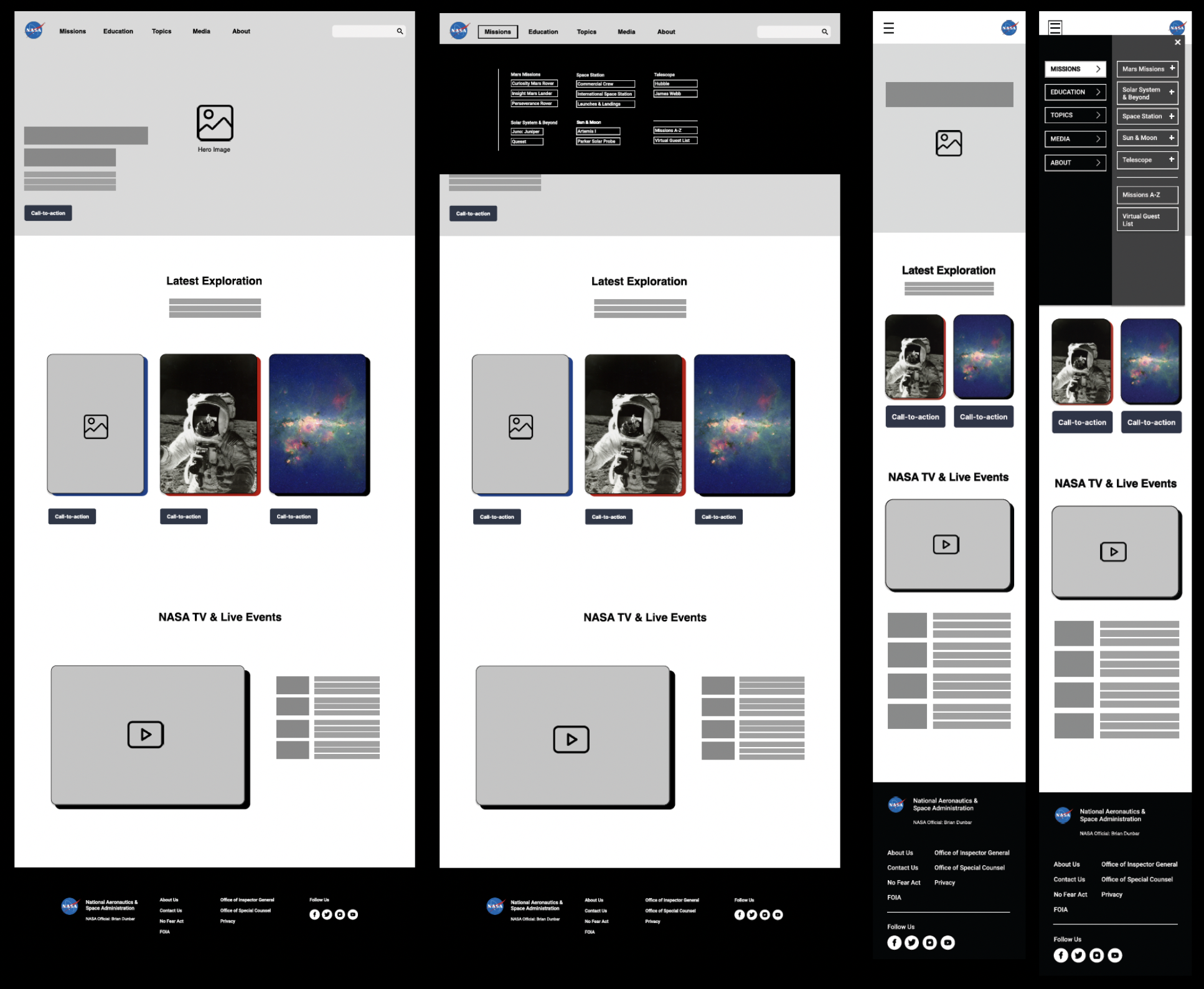
lo-fidelity - wireframes and prototyping
Usability Tests
4 usability tests were conducted to test user flows, and whether users could navigate to Image Library from Homepage with ease and efficiency.
Results
Language was updated to make site navigation clearer for users, the label “Program” was dropped as this was redundant. Labeling “Missions” was easier and more interesting for users.
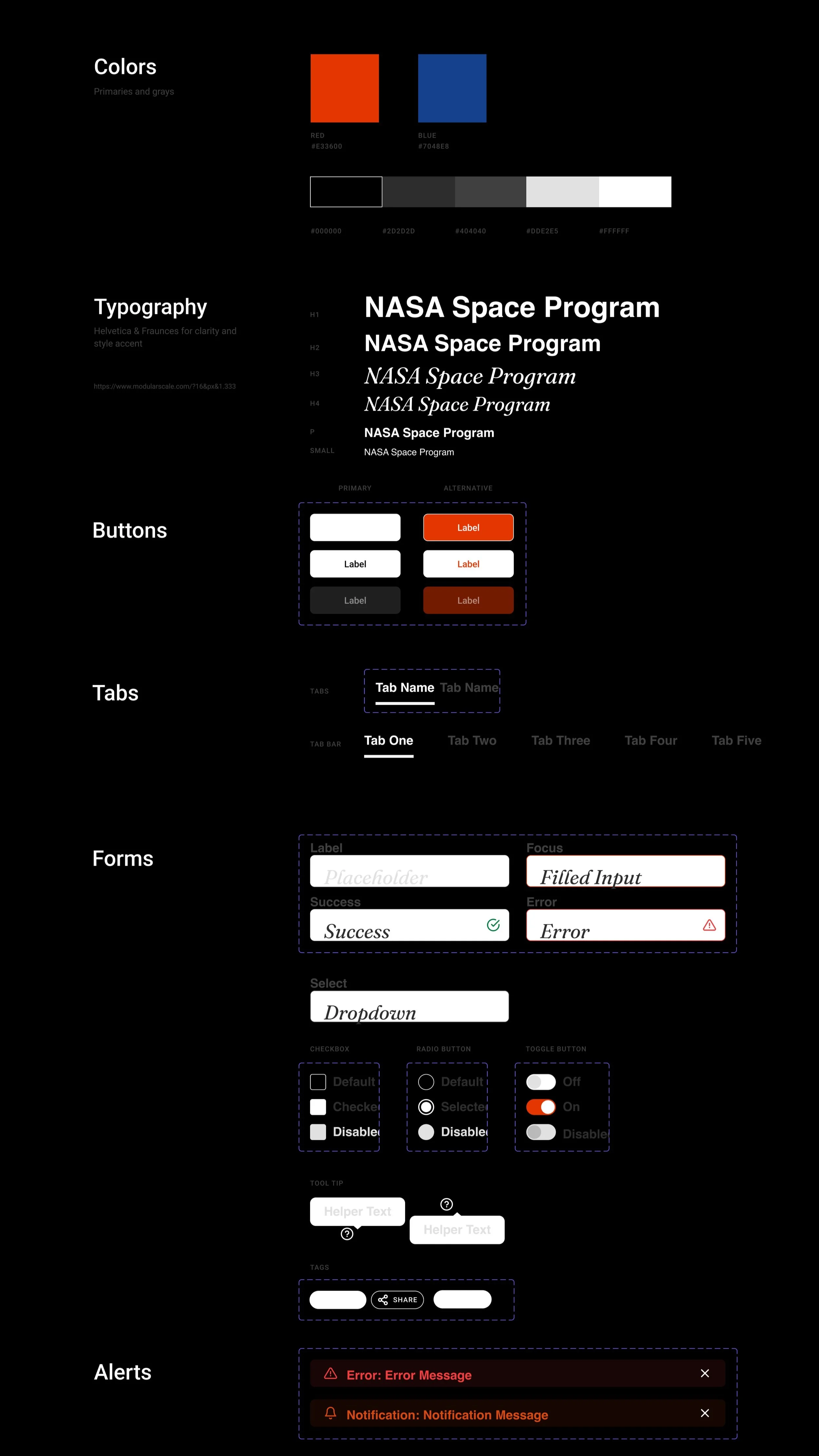
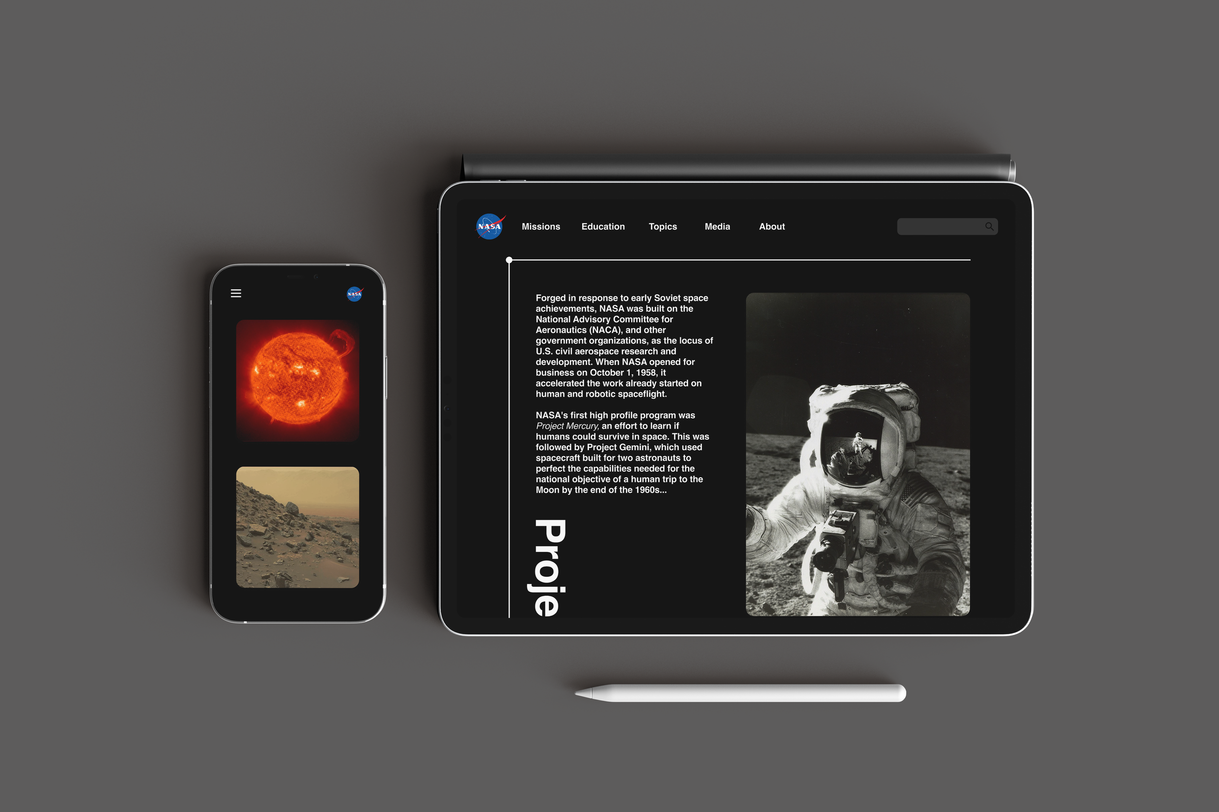
Overall style was updated to darker colors with pops of white, evoking space.
Images were enlarged to highlight and keep the user engaged.
Typeface, look, and feel reflect NASA’s history in exploration and graphic appeal. A combination of updated trends and nostalgia.
“NASA Image Library” was changed to read “NASA Media Library”, differentiating between the archive and Image Gallery pages.
Final Prototype
UI Style Guide
high-fidelity - wireframes and prototyping


Takeaways
NASA’s site is too complex; there is an issue with naming and the overall information architecture of the site. While the new design certainly helped clean up the layout, categories, and structure, there is still much room for improvement to help clarify where to find exactly what you are looking for.
Next steps
Edit/refine and restructure site through another card sorting exercise.
Develop ways for users deeper user engagement. Favoriting, saving content, and interactive elements.

